Dallas County, Iowa and Some Pitfalls of Mapping Demographic Change
Introduction
Some time ago, I noticed that Dallas County, Iowa had the greatest increase of any large county in the country in percentage of residents 25 years and older having at least a bachelor's degree.
I use "large county", incidentally, in the sense of being one of the 814 counties with an ACS 1-year estimate (although the Census tract maps use 5-year estimates), but these cover about 84% of the U.S. population.
Dallas County--a suburban and rural county immediately west of Polk County (Des Moines) which has the rare distinction of voting Mondale/McCain, as Pete Helgason pointed out to me--went from having 26.8% of residents with at least a bachelor's degree to 42.6% (1-year estimate) or 42.1% (5-year estimate)--either way, an increase of more than 15 points.
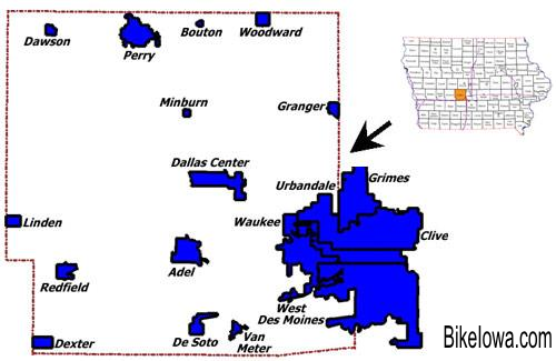
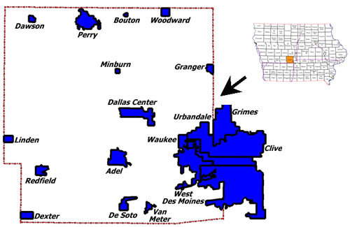
(Thanks to BikeIowa for that map.)
That's higher than the District of Columbia (second on the list, +13.9% from 39.1% to 53%). I decided I wanted a more granular look at this remarkable demographic shift. But long story short? Make sure you map change in total population.
Note: When I say 2012, below, take it to mean "from 2012 5-year estimates".
First Map: Change Within Tracts
My first approach was the same as the one I used in my "Where Has New York City Changed In The Last 10 Years?" post: I combined 2000 and 2010 Census tracts into comparable clusters using Census tract relationship files, and made a map similar to the following. Red tract clusters had increases in percent with a bachelor's degree, blue tract clusters had decreases:
Unfortunately, Dallas County doesn't particularly stand out here. Its tract clusters mostly increased their percentage of degree holders, but no single tract cluster had an increase as large as the county as a whole.
How was that possible? I checked the math by hand, and it wasn't a typo--so the above map isn't explaining what's going on.
Second Map: Change In Total Population
It took me a little while to realize that the answer wasn't in the change within tracts, but in the change between them.
Here is a map of tract clusters, colored by change in total population. Again, red means increase, and blue means decrease.
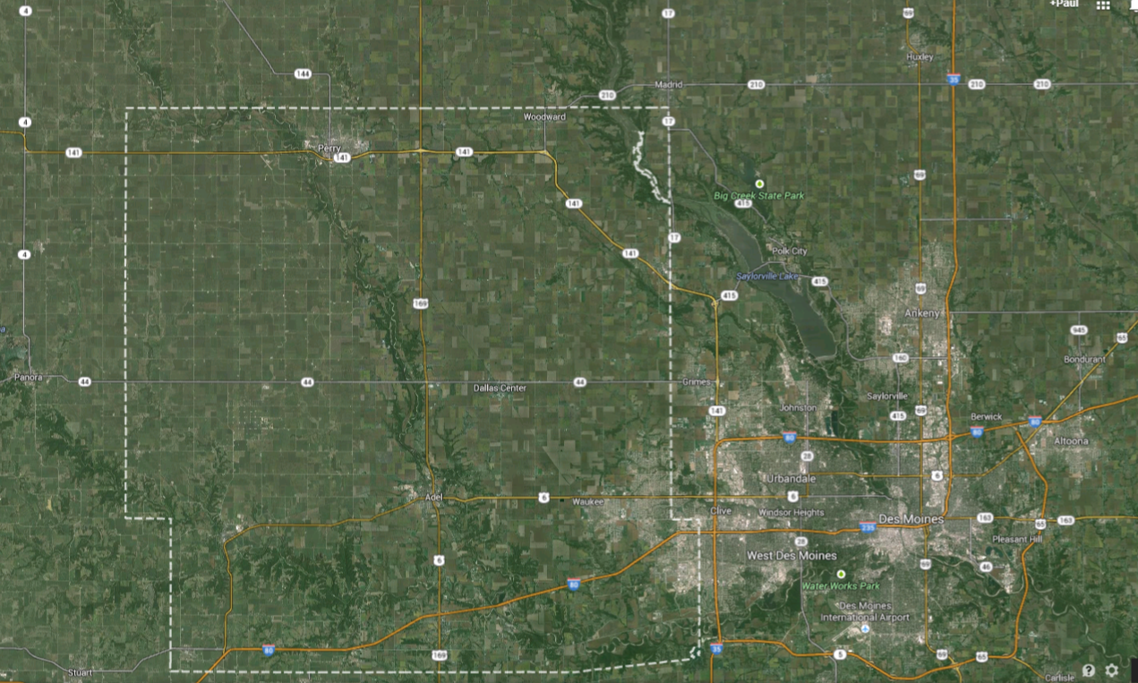
Now, Dallas County stands out--actually, it's not all of Dallas County standing out, but that single cluster of six Census tracts in the southeast. As you can see in the first map or in the below Google Maps screenshot, this cluster includes parts of communities like Clive, Urbandale, Waukee, and West Des Moines, many of which literally sprawl over from Polk County.
This cluster had enormous growth from 2000 to 2012. The population more than tripled (from 10,139 people to 34,332) as did the population over 25.
In fact, it had the second-highest growth rate of any tract cluster in the entire state, behind only a tract covering outer Akney, in Polk County. Without it, Dallas County would have had barely any growth at all. The cluster went from being less than one-fourth of the county to being about half of it. The reapportioning commission basically had to draw an entire new state legislative district to cover this area (House District 44 ).
Explanation
What does this have to do with education? This same cluster is also the most educated part of the county. In 2012, 59.2% of the cluster's residents over 25 had at least a bachelor's degree, compared to 24.1% of the rest of the county:
In 2000, 52.9% of the cluster's residents over 25 had at least a bachelor's degree, compared to 18.4% of the rest of the county.
In other words: The county as a whole had a 15-point increase, but inside this particular cluster there was roughly a 6-point increase, and outside the cluster there was roughly a 6-point increase. Everything else is from change in population size.
Conclusion
Dallas County, Iowa had notable demographic change from 2000 to 2010, with its proportion of residents with a bachelor's degree increasing by 15 points.
However, most of this change wasn't due to the change in any particular neighborhood (at least any particular neighborhood bounded by Census tracts). Rather, much of the change was due to the explosive growth in the most educated part of the county compared to the remainder.
This is kind of a variant of Simpson's paradox, and I think it's an important lesson for map-makers: Look at the change in population between regions, and not simply the changes within regions. Otherwise, you might miss a lot of what's going on.
Data Sources
Numbers from 2000 are from the Census, and numbers from 2012 are from the ACS 5-year estimates.
I used Census tract relationship files, a Python script and the "union-find" method to combine the tracts into comparable "clusters" after throwing out polygons with no current population.
All of the above data sources can be found here. I was also helped by various Mike Bostock blocks, such as this one, etc.